HootStore Redesign - Hootsuite
In 2022, HootStore, Hootsuite’s e-commerce platform for branded merchandise, needed a complete redesign. I had the opportunity to lead and design this project. Below, I share insights into my design process and the outcomes achieved.
Role: Graphic Design Lead
Timeline: 2 weeks
Team: Project Manager, Creative Director, Copywriter, and myself
Problem
The HootStore offers over 100 product variations across three primary regions: Americas, UK, and Europe, along with a dedicated clearance section. This extensive catalogue made it challenging for users to find the right product efficiently. My task was to redesign the e-commerce platform to align with Hootsuite's new branding while ensuring it catered seamlessly to all regions where Hootsuite operates.
Challenges Identified
Complex Navigation
The vast product catalogue made it difficult for users to find the right product efficiently.
Branding Consistency
The website redesign needed to reflect Hootsuite's updated brand identity across allelements.
Regional Differences
Ensuring the site appropriately addresses different needs and preferences of users in the Americas, UK, and Europe.
User Experience
Improving the user journey to enhance satisfaction and drive sales.
Home Screen
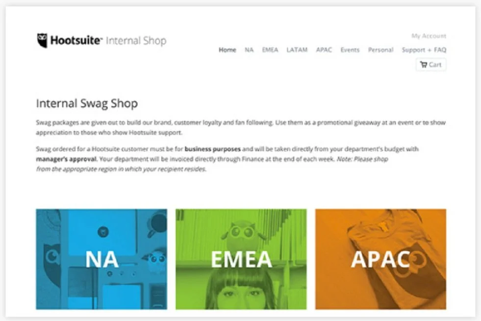
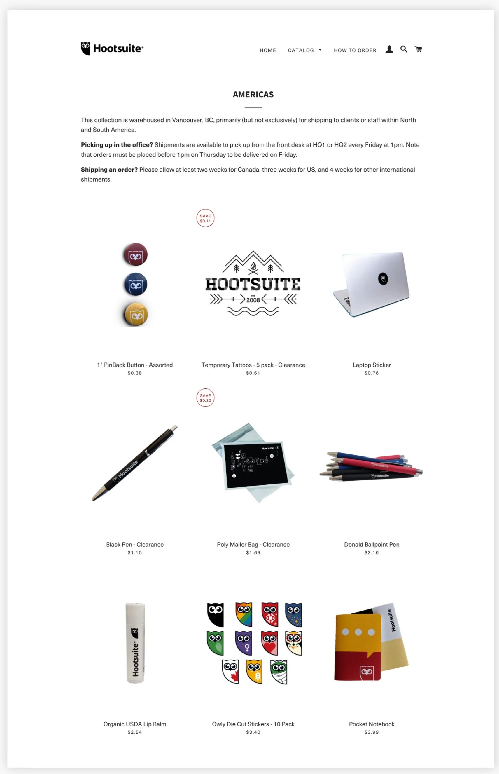
The original home screen was ineffective in showcasing products. It featured images representing different regions but failed to create a sense of desire or engagement. This layout was visually unappealing, confusing users, and outdated, leading to a poor user experience.
To address these issues, the following are the design decisions
Inspired by Hootsuite’s Website: home page design inspired by Hootsuite’s main website to maintain brand consistency while ensuring clear differentiation to avoid user confusion.
Product Showcase: Introduced the What in Stock section to highlight new products and best sellers directly on the home screen. This approach engages users by showcasing popular and latest offerings.
Improved Navigation: Relocated the regional navigation to the bottom of the page, making it easily accessible without cluttering the main visual space. It improved the overall flow and user experience.
Visual Appeal: Updated the visual design to be more modern and appealing, incorporating elements from Hootsuite’s rebranding efforts to create a cohesive and attractive interface.
Previous page
New page
Enhancing Product Collection
Due to time and budget constraints, we couldn't organize a photo shoot with models. This limitation required a creative approach to ensure the product images were appealing and consistent.
Solutions Implemented
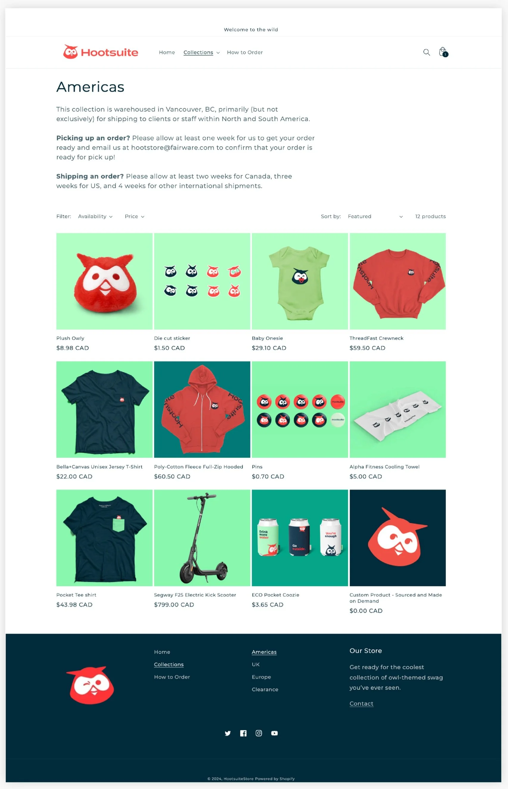
Standardized Visuals: I added a colour background to all product images to maintain a cohesive look. This approach provided a uniform and professional appearance across the site, enhancing visual appeal without needing a model-based photo shoot.
Filter Options: Implemented filtering options, allowing users to search for products based on price range and availability. These filters improved the shopping experience by making it easier for users to find items that met their specific criteria and reducing search time.
Previous page
New page
Shopping a Product
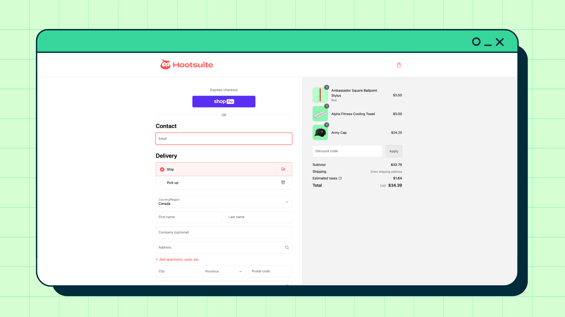
To improve the shopping experience and ensure users didn't miss crucial information, I implemented these changes:
Highlighting Style Options: Introduced coloured style buttons to make the selection options more prominent. This visual cue ensured that users could identify and choose different styles orvariations of a product.
Important Information in Red: Use red to highlight all critical information, such as pricing, availability, and special offers. This colour choice drew attention to essential details, helping users make informed purchasing decisions quickly.
Mobile
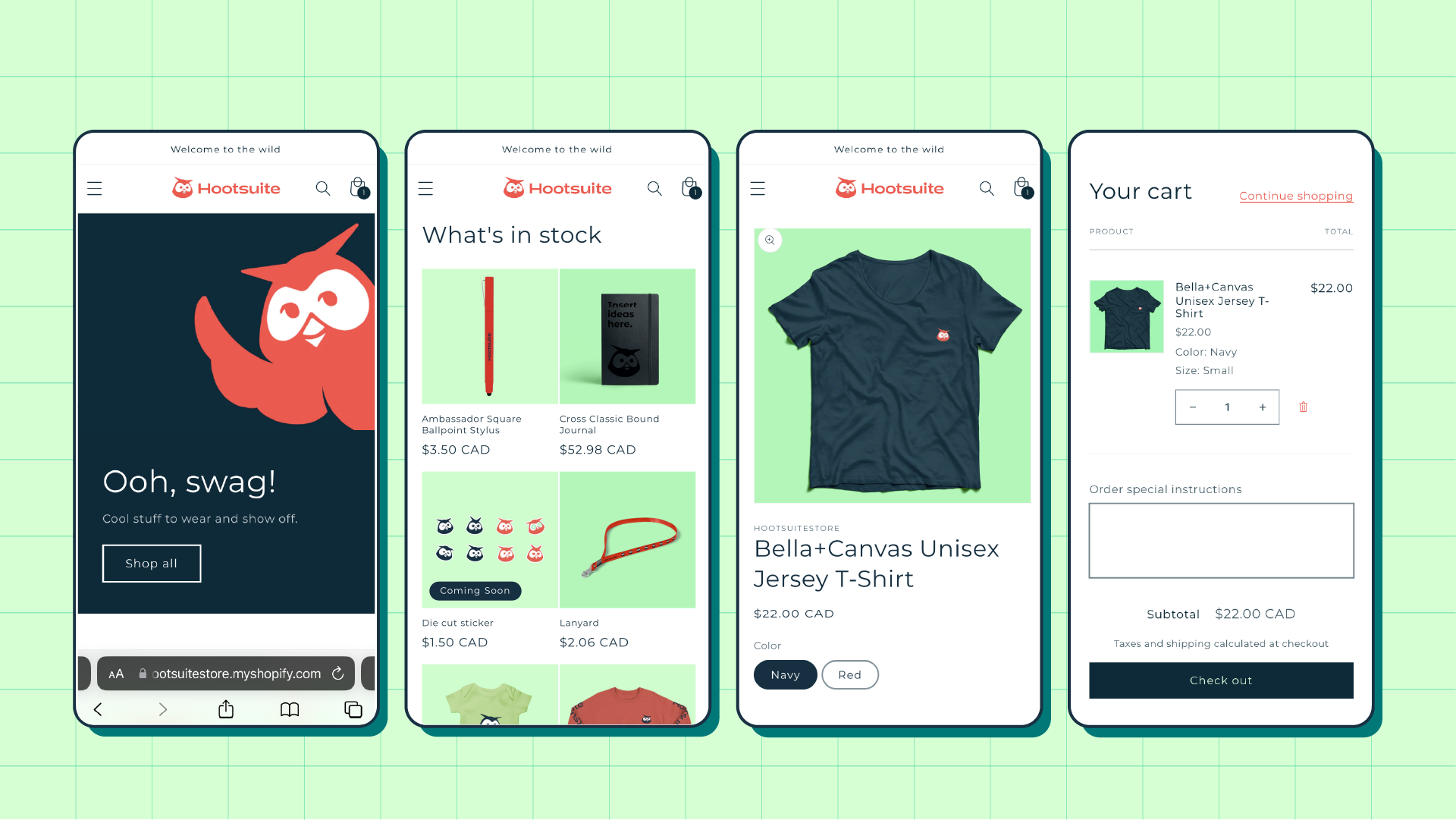
Adapting the e-commerce site for mobile platforms was challenging due to limited CMS control. Ensuring a seamless and visually appealing experience on smaller screens required strategic adjustments.
Image Selection: Selected and resized imagesto adapt across various screen dimensions, preserving image integrity.
Optimized Layout: Adjusted the layout to fit smaller screens, ensuring elements like navigation and product images remained accessible and user-friendly.
Responsive Design: Enabled automatic adjustment to various screen sizes for a consistent user experience.
Project Outcome
The redesigned HootStore streamlined the ordering process and enhanced the gifting experience with an intuitive, user-friendly, and accessible platform.
Simplified Ordering: Easier navigation and purchasing process for team members.
Improved Gifting: Enhanced layout made selecting and sending gifts more enjoyable.
Accessibility: Adhered to best practices, ensuring the platform was accessible to all users.
Hootsuite's rebrand recognitions
Hootsuite’s rebranding efforts, including the HootStore redesign, received notable industry recognition and positively impacted business metrics:
Fast Company 2023 Innovation by Design Awards:
Categories: “Best Branding” and “Enduring Impact.”
Shorty Awards (2022):
Gold Honor for Rebrand Campaign.
Transform Awards North America (2022):
Silver: Best Brand Evolution (Business) and Silver: Best Use of Copy + Tone of Voice.

